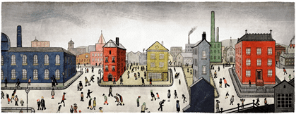
It’s certainly one of them!
Google’s visual identity is so strong, they can mess with it all they want and we still recognise it.
Their regular Google Doodles (used to commemorate or celebrate people and events, or just for a fun game of Pacman) has changed our perception of their visual branding. We don’t even need to see the letters that spell the company name for us to identify them.
Today’s was a great example of that for me. Over time their Doodle’s have become more adventurous, and here we are on the 125th birthday of artist T. S. Lowry with one of the boldest yet.

It ties into their primary visual identity through colour, position of objects, and vaguely the shape of the buildings too. And that’s it.
Yet I know this is Google. I can see it. In fact, when I’m shown one of these Doodles I actively look and seek out how their logo fits in. I want to see their visual brand in these images.
Now that’s branding.