 Last year I wrote about my penchant for designing everything from logos to databases and scripts on the back of envelopes.
My final sentence read, “How do you work? Scribbles? Itemised lists? Walls of Post-it notes?”
Well, the last item in that list isn’t just plucked from the top of my head—I love walls of post-it notes.
Often I’m asked to take a look at my clients’ site structure, to see if their menu is really working from a user experience perspective.
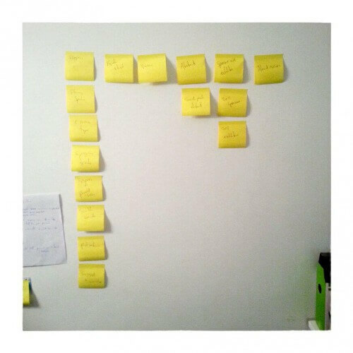
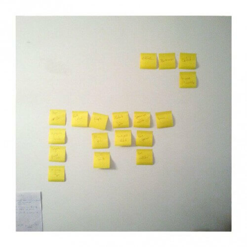
Below you can see one I worked on this morning, both the before and after shot. As it was, almost all their pages came under one top level heading, which meant most of their visitors’ interactions were going to be done under one sub-heading, while the rest of the menu was underused.
By sticking some Post-it notes on my wall I could easily rearrange it all so information is more evenly distributed, while also merging a couple of the original top level items so the content of each menu is obvious at a glance.
But this case-study aside, I’m always interested to see how people (including myself) best organise and plan in the physical world, before transferring that information to the digital.

